
In today’s fast-evolving digital landscape, developers and designers are constantly searching for ways to create responsive, scalable, and user-friendly interfaces. One concept that has started gaining attention in modern front-end development is pxless. While it may sound technical at first, the idea behind pxless is simple yet powerful: reducing or eliminating the reliance on fixed pixel units in favor of more flexible, adaptable sizing methods.
This article explores what pxless means, why it matters, and how it can improve your design workflow. Whether you’re a beginner or an experienced developer, understanding this approach can help you build better digital experiences.
What is pxless?
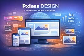
The term pxless refers to a design and development philosophy where pixel-based units (px) are minimized or avoided entirely in styling elements. Instead of using fixed pixel values, developers rely on relative units such as percentages, em, rem, vw, and vh.
Pixels are absolute units, which means they don’t adapt well across different screen sizes or resolutions. A pxless approach encourages fluid layouts that respond naturally to varying devices, from small smartphones to large desktop screens.
By adopting pxless techniques, developers can create interfaces that are more flexible, accessible, and consistent across platforms.
Why pxless Matters in Modern Web Design
Responsive Design Demands Flexibility
With users accessing websites on a wide range of devices, responsive design is no longer optional. Fixed pixel values can cause layout issues, especially on smaller or larger screens. pxless helps ensure that elements scale proportionally, maintaining usability and visual balance.
Improved Accessibility
Accessibility is a critical part of user experience. Relative units allow users to adjust font sizes and zoom levels without breaking the layout. This is particularly important for users with visual impairments.
Better Maintainability
When designs rely heavily on pixels, making changes can become tedious. A pxles system creates a more consistent structure, making it easier to update styles across an entire project.
Future-Proof Design
As new devices and screen resolutions emerge, pxles designs adapt more easily. This reduces the need for constant redesigns and ensures long-term usability.
Core Principles of pxless Design
Use Relative Units
Instead of pixels, pxles encourages the use of:
- rem for font sizes and spacing
- em for scalable components
- percentages for layout widths
- viewport units like vw and vh for responsive sizing
These units allow elements to adjust based on context, making layouts more fluid.
Build a Scalable Typography System
Typography plays a key role in user experience. In a pxles system, font sizes are defined relative to a base size, often set on the root element. This creates a consistent scale that adjusts naturally across devices.
Focus on Proportions, Not Fixed Sizes
Designing with proportions ensures that elements maintain their relationships regardless of screen size. This approach leads to more harmonious and adaptable layouts.
Embrace Fluid Layouts
Instead of fixed-width containers, pxlss design promotes flexible grids and layouts. This allows content to flow naturally, improving readability and usability.
Key Features of pxless
Device Adaptability
One of the strongest advantages of pxless is its ability to adapt to different devices without requiring separate styles for each screen size. This simplifies development and enhances user experience.
Consistent Scaling
With relative units, elements scale in relation to one another. This ensures that spacing, typography, and layout remain visually balanced.
Reduced CSS Complexity
By using a consistent system of relative units, developers can reduce the complexity of their stylesheets. This leads to cleaner, more organized code.
Enhanced User Experience
Users benefit from smoother interactions, better readability, and layouts that feel natural on any device.
Practical Applications of pxless
Typography
Using rem units for font sizes allows text to scale based on the root font size. This ensures consistency and accessibility across the site.
Layout Design
Instead of setting widths in pixels, developers can use percentages or viewport units. This creates layouts that adjust dynamically to screen size.
Spacing and Margins
Spacing defined with em or rem units maintains proportional relationships between elements, improving visual consistency.
Media Queries
While pxles reduces reliance on pixels, media queries can still be used effectively with em or rem units. This ensures breakpoints adapt to user settings.
Challenges of pxless
Learning Curve
For developers accustomed to pixel-based design, transitioning to pxles can take time. Understanding how relative units interact requires practice.
Browser Inconsistencies
Although modern browsers support relative units well, minor inconsistencies can still occur. Testing across multiple devices is essential.
Precision Limitations
In some cases, pixel-perfect design may be necessary, especially for specific UI elements. pxles does not eliminate pixels entirely but encourages their minimal use.
Best Practices for Implementing pxless
Start with a Base Font Size
Set a root font size that serves as the foundation for all relative units. This makes calculations easier and ensures consistency.
Use rem for Global Consistency
rem units are based on the root element, making them ideal for maintaining uniform scaling across the entire site.
Combine Units Strategically
pxless does not mean avoiding all units except one. A combination of rem, em, percentages, and viewport units often works best.
Test Across Devices
Always test your design on different screen sizes and resolutions to ensure it behaves as expected.
Keep It Simple
Avoid overcomplicating your design system. A clean, straightforward approach leads to better results.
pxless vs Traditional Pixel-Based Design
Traditional pixel-based design focuses on fixed values, which can limit flexibility. While it offers precision, it often struggles with responsiveness.
pxless, on the other hand, prioritizes adaptability and scalability. It aligns with modern web standards and user expectations, making it a preferred approach for many developers.
However, the choice between the two depends on the project. In many cases, a hybrid approach works best, combining the strengths of both methods.
The Future of pxless
As web technologies continue to evolve, the importance of flexible design systems will only grow. pxless represents a shift toward more user-centered design, where adaptability and accessibility take priority.
With the rise of responsive frameworks and design systems, pxless is likely to become a standard practice in front-end development. Developers who embrace this approach early will be better prepared for future challenges.
Conclusion
pxless is more than just a trend; it is a practical and forward-thinking approach to web design. By reducing reliance on fixed pixel units and embracing relative sizing, developers can create interfaces that are responsive, accessible, and easy to maintain.
While it may require a shift in mindset, the benefits of pxless far outweigh the challenges. From improved user experience to better scalability, this approach offers a solid foundation for modern web development.
As the digital world continues to expand, adopting flexible design principles like pxless will be essential for creating websites that truly meet user needs.
FAQs
What does pxless mean in web design?
pxless refers to a design approach that minimizes the use of pixel units and instead relies on relative units like rem, em, and percentages to create flexible and responsive layouts.
Is pxless better than using pixels?
pxless is often better for responsive and accessible design because it allows elements to adapt to different screen sizes. However, pixels can still be useful in specific situations where precision is required.
Can I completely avoid pixels in pxless design?
While the goal is to reduce pixel usage, it is not always necessary to eliminate them entirely. A balanced approach that uses pixels only when needed works best.
What units are commonly used in pxless design?
Common units include rem, em, percentages, and viewport units such as vw and vh. These units help create scalable and adaptable layouts.
Is pxless suitable for beginners?
Yes, beginners can learn pxless with practice. While there may be a learning curve, understanding relative units and responsive design principles can significantly improve development skills.